Day 7: Size effects
Welcome to the last day of the first week of 30 days of backtesting! We hope you’re enjoying the ride. If you have any questions or concerns, you can reach us at the contact details listed at the bottom of this post.
On Day 6 we defined momentum rather roughly and ran a bunch of tests to identify the linear relationship between different lookback and look forward periods. However, we didn’t go into detail about the results. Let’s do that now.
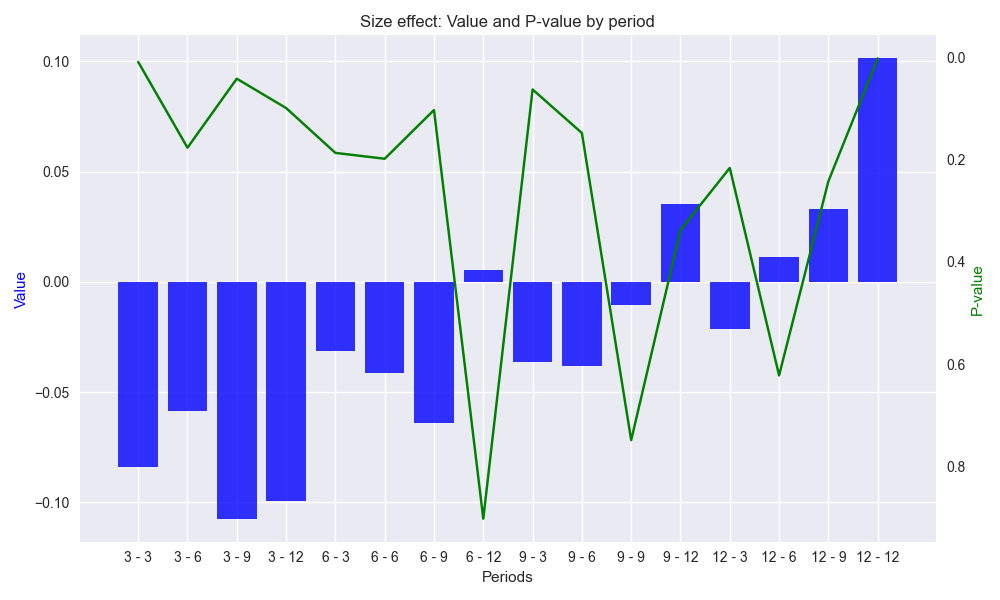
As shown in the graph below, we have 16 combinations of different lookback and look forward periods of 3, 6, 9, and 12 weeks. The [12 - 12] label on the [Periods] axis means 12-week lookback with 12-week look forward, which we’ll refer to as 12-by-12. The blue bars are the size effect (or \(x\) coefficient if preferred) that we derive when regressing the look forward against the lookback period. The green line is the p-value – the probability that the data are random – of the size effect. In this case, below 0.05 is desirable, although there is no rigorous proof for that. Note: we reversed the order of the right y-axis to align better with the bars. That is, lower p-values (what we want) are higher on the graph matching higher size effects.

A few summary points are in order. All the size effects are relatively small and almost three-quarters are negative. This suggests modest reversals in the look forward period relative to the lookback in most cases. Less than 20% of the p-values are 0.05 or below. There is a relatively high (~75%) negative correlation between p-values and the absolute value of the size effect. In other words, as the size effects increase (in absolute terms), p-values decrease, which should be intuitive. The top three largest lookback-look forward combinations in terms of absolute size effect (in ascending order) and small p-value (in descending order) are 12-by-12, 3-by-3, and 3-by-9.
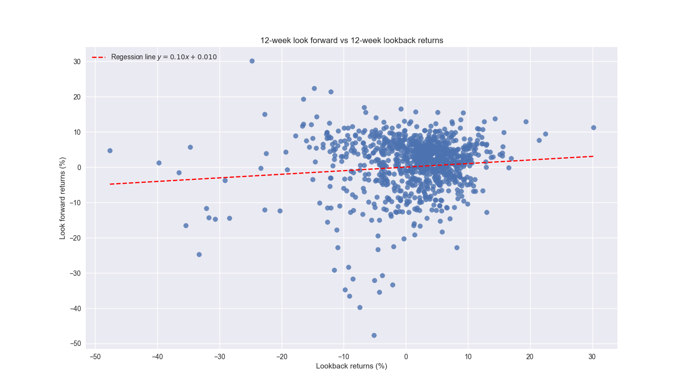
Only 12-by-12 has a positive size effect. We should store this in the back of our mind because it suggests that the 12-by-12 might work better for a trend following strategy, while the others might be better at reversals. Whatever the case, let’s look at the scatter plot of look forward vs. lookback returns for the 12-by-12 combination.

As shown, the regression line has a positive, but modest, gradient. Over 75% of the observations cluster in the -10% to 10% range for both lookback and look forward returns. In that range, average and median returns for the lookback and look forward periods are 2.3% and 1.8%, and 3% and 2.5%, indicating a slightly negative skew.We’ll leave this analysis for now, and finish up examining baseline effects in our next post. Code below.
# Built using Python 3.10.19 and a virtual environment

# Load libraries
import pandas as pd
import numpy as np
from datetime import datetime, timedelta
import statsmodels.api as sm
import matplotlib.pyplot as plt
from matplotlib.ticker import FuncFormatter

plt.style.use('seaborn-v0_8')
plt.rcParams['figure.figsize'] = (14,8)

# Load data
df = yf.download('SPY', start='2000-01-01', end='2024-10-01')
df.columns = ['open', 'high', 'low', 'close', 'adj close', 'volume']
df.index.name = 'date'

# Create training set and downsample to weekly ending Friday
df_train = df.loc[:'2019-01-01', 'adj close'].copy()
df_w = pd.DataFrame(df_train.resample('W-FRI').last())
df_w.columns = ['price']

# Iterate through lookback and look forward periods
periods = [3, 6, 9, 12]
momo_dict = {}
for back in periods:
    for forward in periods:
        df_out = df_w.copy()
        df_out['ret_back'] = np.log(df_out['price']/df_out['price'].shift(back))
        df_out['ret_for'] = np.log(df_out['price'].shift(-forward)/df_out['price'])
        df_out = df_out.dropna()

        mod = sm.OLS(df_out['ret_for'], sm.add_constant(df_out['ret_back'])).fit()
        momo_dict[f"{back} - {forward}"] = {'data': df_out,
                                            'params': mod.params,
                                            'pvalues': mod.pvalues}

# Create Results data frame
df_results = pd.DataFrame({'periods': [key for key in momo_dict.keys()],
              'beta': [momo_dict[key]['params']['ret_back'] for key in momo_dict],
              'alpha': [momo_dict[key]['params']['const'] for key in momo_dict],
              'beta_pvalue': [momo_dict[key]['pvalues']['ret_back'] for key in momo_dict],
              'alpha_pvalue': [momo_dict[key]['pvalues']['const'] for key in momo_dict]
              })

# Create function to graph bar and line chart
def bar_and_line_plot(data: pd.DataFrame, x_var: str, y_bar: str, y_line: str,
                      y_bar_lab: str = 'Value', y_line_lab: str = 'P-value',
                      title: str = 'Size effect', save_fig: bool = False,
                      fig_title: str = 'size_effect_p_value',  ) -> None:
    fig, ax1 = plt.subplots(figsize=(10, 6))

    # Use datetime if available, else use numeric index
    x_axis = data[x_var]

    # Plot the area for the number of trades (background)
    ax1.bar(x_axis, data[y_bar], color='blue', label=y_bar_lab, alpha=0.8)
    ax1.set_xlabel('Periods')
    ax1.set_ylabel(y_bar_lab, color='blue')

    # Overlay the cumulative win rate (line plot)
    ax2 = ax1.twinx()  # Create a secondary y-axis for the win rate
    ax2.plot(x_axis, df_results[y_line], color='green', label=y_line_lab)
    ax2.set_ylabel(y_line_lab, color='green')
    ax2.invert_yaxis()

    # Add titles and grid
    plt.title(f"{title}: {y_bar_lab} and {y_line_lab} by period")
    ax2.grid()

    fig.tight_layout()

    if save_fig:
        plt.savefig(f"{title.lower()}_{fig_title}.png")
    plt.show()


# Create scatter plot function
def dict_scatter_plot(combo: str, save_fig: bool = False) -> None:
    x_dots = momo_dict[combo]['data']['ret_back']*100
    y_dots = momo_dict[combo]['data']['ret_for']*100
    x_range = np.linspace(x_dots.min(), x_dots.max(), 20)
    m = momo_dict[combo]['params']['ret_back']
    b = momo_dict[combo]['params']['const']
    y_range =  m*x_range + b

    plt.figure()
    plt.scatter(x_dots, y_dots, alpha=0.8, label="")
    plt.plot(x_range, y_range, 'r--' , label=f"Regession line $y = {m:0.2f}x + {b:0.3f}$")
    plt.xlabel('Lookback returns (%)')
    plt.ylabel('Look forward returns (%)')
    # plt.legend([None, f"Regession line $y = {m:0.2f}x + {b:0.3f}$"], loc='upper left')
    plt.legend(loc='upper left')
    plt.title(f'{combo[:2]}-week look forward vs {combo[-2:]}-week lookback returns')
    if save_fig:
        plt.savefig(f'images/momo_scatter_{combo.replace(" ", "")}.png')
    plt.show()

# Graph size effects and p-values
bar_and_line_plot(df_results, 'periods', 'beta', 'beta_pvalue', save_fig=True)

# Graph scatter plot
dict_scatter_plot('12 - 12', save_fig=True)