Day 8: Baseline effects
Yesterday, we discussed the size effects, their statistical significance (e.g., p-values), and some other summary statistics for the various momentum combinations – namely, 3, 6, 9, and 12 week lookback and look forward returns. We found that size effects were small, but a few were significant, and that in the case of the 12-by-12 combination about 75% of the results clustered in the -10% to 10% range for both directions – forward and back.
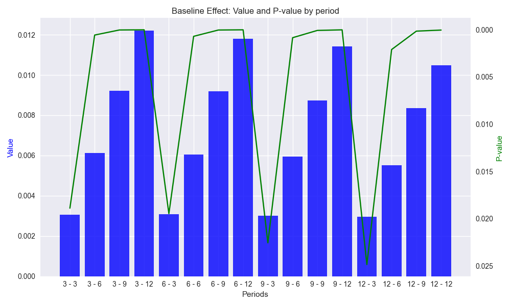
Today we’ll look at the baseline effect (or constant or intercept) of the regression equations. While not always relevant, when it comes to analyzing the alpha of a strategy – the returns that accrue irrespective of the market – the baseline is important. Thus, we might as well get into the habit of thinking about it. We show a graph of the baseline effect for the different combinations similar to what we showed for the size effect.Note: we invert the secondary y-axis so that lower p-values match higher baseline effects.

A few things are immediately apparent from the graph. The baseline effects are small, averaging less that 1%, but increase with time. That should be intuitive once one recalls the period of examination, 2000-2018 on a weekly basis, was one with a generally upward trend despite the Global Financial Crisis, the European Debt Crisis,1 one US debt ceiling and government shutdown altercation after another, yield curve inversion, and all the other tragedies predicted but never realized.2 The graph also shows that all of the baseline effects are significant – that is, unlikely to have been caused by randomness, whatever that is. A final observation is that the heights of all baseline effects are very similar for the look forward period. That is, regardless of the lookback period, the 3, 6, 9, or 12-week look forward periods have close to the same baseline effect. Again, not too surprising based on the historical record, but does suggest a relative stability of returns within different timeframes regardless of prior period. 3
There might be other gems we could extract from density of this analysis, but we’ll leave it there for now. Tomorrow the fun really begins. Forecasting!
Code below
# Built using Python 3.10.19 and a virtual environment

# Load libraries
import pandas as pd
import numpy as np
from datetime import datetime, timedelta
import statsmodels.api as sm
import matplotlib.pyplot as plt
from matplotlib.ticker import FuncFormatter

plt.style.use('seaborn-v0_8')
plt.rcParams['figure.figsize'] = (14,8)

# Load data
df = yf.download('SPY', start='2000-01-01', end='2024-10-01')
df.columns = ['open', 'high', 'low', 'close', 'adj close', 'volume']
df.index.name = 'date'

# Create training set and downsample to weekly ending Friday
df_train = df.loc[:'2019-01-01', 'adj close'].copy()
df_w = pd.DataFrame(df_train.resample('W-FRI').last())
df_w.columns = ['price']

# Iterate through lookback and look forward periods
periods = [3, 6, 9, 12]
momo_dict = {}
for back in periods:
    for forward in periods:
        df_out = df_w.copy()
        df_out['ret_back'] = np.log(df_out['price']/df_out['price'].shift(back))
        df_out['ret_for'] = np.log(df_out['price'].shift(-forward)/df_out['price'])
        df_out = df_out.dropna()

        mod = sm.OLS(df_out['ret_for'], sm.add_constant(df_out['ret_back'])).fit()
        momo_dict[f"{back} - {forward}"] = {'data': df_out,
                                            'params': mod.params,
                                            'pvalues': mod.pvalues}

# Create Results data frame
df_results = pd.DataFrame({'periods': [key for key in momo_dict.keys()],
              'beta': [momo_dict[key]['params']['ret_back'] for key in momo_dict],
              'alpha': [momo_dict[key]['params']['const'] for key in momo_dict],
              'beta_pvalue': [momo_dict[key]['pvalues']['ret_back'] for key in momo_dict],
              'alpha_pvalue': [momo_dict[key]['pvalues']['const'] for key in momo_dict]
              })

# Create function to graph bar and line chart
def bar_and_line_plot(data: pd.DataFrame, x_var: str, y_bar: str, y_line: str,
                      y_bar_lab: str = 'Value', y_line_lab: str = 'P-value',
                      title: str = 'Size effect', save_fig: bool = False,
                      fig_title: str = 'size_effect_p_value',  ) -> None:
    fig, ax1 = plt.subplots(figsize=(10, 6))

    # Use datetime if available, else use numeric index
    x_axis = data[x_var]

    # Plot the area for the number of trades (background)
    ax1.bar(x_axis, data[y_bar], color='blue', label=y_bar_lab, alpha=0.8)
    ax1.set_xlabel('Periods')
    ax1.set_ylabel(y_bar_lab, color='blue')

    # Overlay the cumulative win rate (line plot)
    ax2 = ax1.twinx()  # Create a secondary y-axis for the win rate
    ax2.plot(x_axis, df_results[y_line], color='green', label=y_line_lab)
    ax2.set_ylabel(y_line_lab, color='green')
    ax2.invert_yaxis()

    # Add titles and grid
    plt.title(f"{title}: {y_bar_lab} and {y_line_lab} by period")
    ax2.grid()

    fig.tight_layout()

    if save_fig:
        plt.savefig(f"{title.lower()}_{fig_title}.png")
    plt.show()

# Graph baseline effects and p-values
bar_and_line_plot(df_results, 'periods', 'alpha', 'alpha_pvalue', title='Baseline Effect', save_fig=True)
Remember the PIIGS?↩︎
It’s hard not to think of the Mark Twain putative quote, “I’ve suffered a great many catastrophes in my life. Most of them never happened.” Interestingly, this quote has no definite attribution to any of his writings.↩︎
It would be interesting to compare such baseline effects with other broad based market indices outside of the US to see if the phenomenon persists. We would think not, a priori, but we’ll save that for another post that never gets written.↩︎