Yield curve predictions twist my noodle
As we saw in the last post, one iteration of the yield curve – the spread between 10-year and 3-month Treasuries – doesn’t generate a great model of recession probabilities. Part of this is that recessions are not that common, so we’re trying to find the veritable needle. Another problem is picking the right threshold to say the model is prediciting a greater likelihood of the economy being recession. Recall, if the data suggest recessions only occur 14% of the time, why should we use a threshold of greater than 50% in terms of the probabilities? But as we found, if we lower that threshold to improve the chance of identifying a recession (improving specificity) we end up lowering the overall accuracy. In fact, when we improve the ability to identify a recession to almost even odds, we end up lowering our accuracy to no better than a coin flip.
Where did we go wrong?
Nowhere actually. We’re performing the analysis in an order to move from simple to more complex to keep things clear but also be more precise about what is meant by the claim that yield curve predicts recessions. The simple approach was flawed nonetheless. As we pointed out earlier, while the curve starts to decline prior to a recession, it reverts once the recession is in full swing. The reason: the Fed lowers interest rates to spur the economy.
What a yield curve model is supposed to do is predict a recession in the future, not the present. Predicting a recession in the present? How does that make sense. That is, in fact, an important area of study that falls under the rubric of “nowcasting”. It’s important because most of the data that classify whether the economy is in a recession (GDP, for instance) are often delayed by weeks or months. Having a robust framework to classify the state of the economy in real time is useful. But we won’t focus on nowcasting in this post; that’s in the future.
Our goal in this post is to tweak our previous model to try to predict a recession in the future. We’ll first use a six month look ahead and then 12 months by lagging the yield curve data. Then we’ll do the same thing by creating a time series that turns the yield curve into a binary.
Not another model!
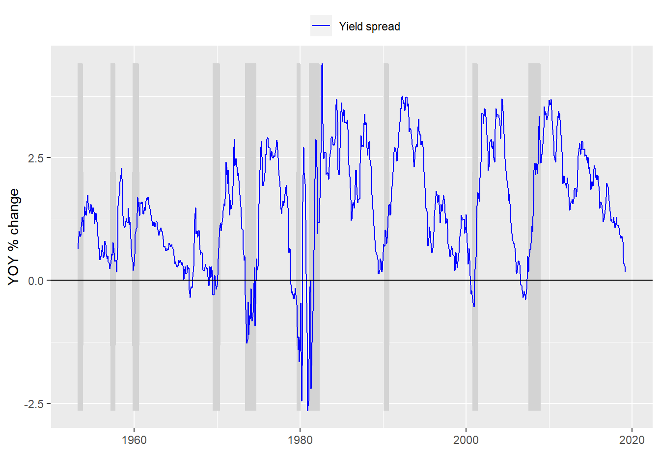
We first lag the yield curve data (or lead the recession data) by six months to compare the yield curve against the presence of a recession six months of the future. A graph of what that looks like is below.

Next we build a model based on that altered data and present the confusion matrix.
| Predicted/Actual | No recession | Recession |
|---|---|---|
| No recession | 678 | 97 |
| Recession | 5 | 12 |
With the usual metrics:
- Accuracy: 87%
- Specificity: 11%
- False positive rate: 89%
Interestingly the model isn’t that much better than a simplistic one. But lets look at what happens to specification and accuracy if we lower the threshold.

Eureka! Somewhere between a threshold of 0.14 to 0.16 we find both good specification and accuracy.
Well, that might be a little hasty. We still need to compare with the 12 month look ahead. And while this model may be okay for identifying a recession in 6 months ahead it is based on historical data. We have no idea if this, or any other model, will work that well on data it hasn’t seen. That’s where machine learning comes in. But we’ll save that for the next few posts.
Here’s the code for the post:
# Load package
library(tidyquant)

# Load data
df <- readRDS("yield_curve.rds")

# Process data
df_6 <- df %>% mutate(usrec = lead(usrec, 6, default = 0))

# Plot model
df_6 %>% ggplot(aes(x = date)) +
  geom_ribbon(aes(ymin = usrec*min(time_spread), ymax = usrec*max(time_spread)), fill = "lightgrey") +
  geom_line(aes(y = time_spread, color = "Yield spread")) +
  scale_colour_manual("",
                      breaks = c("Yield spread"),
                      values = c("blue")) +
  ylab("YOY % change") + xlab("") + ylim(c(min(df_6$time_spread), max(df_6$time_spread))) +
  geom_hline(yintercept = 0, color = "black") +
  theme(legend.position = "top", legend.box.spacing = unit(0.05, "cm"))

model_6 <- glm(usrec ~ time_spread, df_6, family = binomial)

# Predict on test set
pred_6 <- predict(model_6, df_6, type = "response")

# Check with actuals
probs_6 <- rep(0,nrow(df_6))
probs_6[pred_6 > 0.5] <- 1
tab <- table(Predicted = probs_6, Actual = df_6$usrec)
rownames(tab) <- c("No recession", "Recession")
colnames(tab) <- c("No recession", "Recession")
library(printr)
tab

# Build specification function
spec_func <- function(threshold, df){
  probs <- pred_6 > threshold
  tab <- table(probs, df$usrec)
  if(nrow(tab) == 1){
    return(0)
  }else{
    return(tab[2,2]/(tab[2,2] + tab[1,2]))
  }
}

# Build accuracy function
acc_func <- function(threshold, df){
  probs <- pred_6 > threshold
  tab <- table(probs, df$usrec)
  if(nrow(tab) == 1){
    return(tab[1,1]/sum(tab))
  }else{
    return((tab[2,2] + tab[1,1])/sum(tab))
  }
}

# Loop through functions
spec_6 <- c()
# Run specification
spec_6 <- c()
for(i in 1:20){
  spec_6[i] <- spec_func(i*.01, df_6)
}

acc_6 <- c()
for(i in 1:20){
  acc_6[i] <- acc_func(i*.01, df_6)
}

# Create data frame, tidy, and graph
acc_spec <- data.frame(Threshold = seq(0.01, 0.20, 0.01), Accuracy = acc_6, Specificity = spec_6)
acc_spec <- acc_spec %>% gather(Test, Value, -Threshold)
acc_spec %>% ggplot(aes(Threshold, Value, color = Test)) +
  geom_line() +
  xlim(c(0.1,0.2)) +
  theme(legend.position = "top", legend.box.spacing = unit(0.05, "cm"))